Photos, mostly comes to you a week early this October, and at the expense of my usual havering on street photography. Instead, this month, we begin the 1st of an occasional series of interviews, Conversations, mostly.
My 1st conversation for the series is, appropriately enough, with the 1st photography writer on Substack, the Amsterdam-based photographer and curator, Wesley Verhoeve. Wesley's excellent newsletter, Process, is a must-read from an insightful, thoughtful photographer. 13,000 readers can't be wrong, after all!
Wesley's photography has been featured in the New York Times, National Geographic Traveler, Washington Post, Wired, New York Magazine, Volkskrant, and many others. He is the founding curator of the Projected series at the International Center of Photography in New York, and currently curates Process Projected, a bi-monthly exhibition series at the WIHH Gallery in Amsterdam.
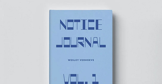
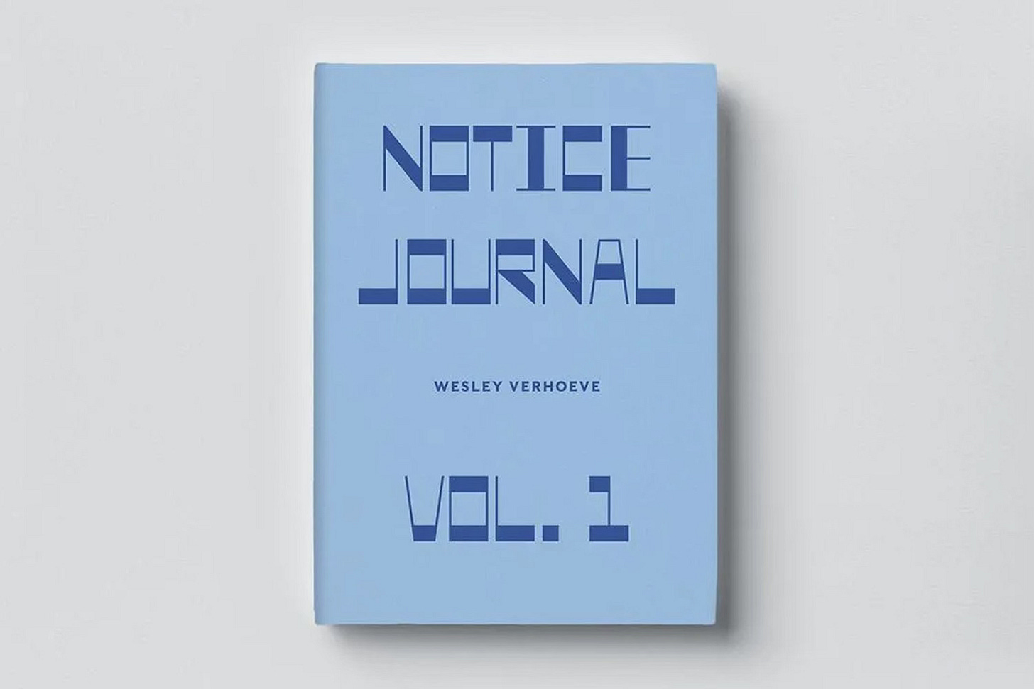
Wesley's first monograph, NOTICE, was published by New Style Publishing in 2021 and is now in its second printing. This November, he will publish NOTICE Journal Volume One, and he and I had a chat about this new book which began its presale on Sunday 20th October.
You can read more about the different editions, the early-bird pricing, and how to order the book over on Process. Without any further ado, here is my conversation with Wesley. Enjoy.
Neil Milton: NOTICE Journal, Volume One revisits Amsterdam over three consecutive springs. Given the season’s inherent association with rebirth and growth, how did your own personal transformations over this time influence the project and the photographs that you made?
Wesley Verhoeve: Over those three springs, I went through some major changes in my life, following a move from one continent to another. I think we all have experienced challenging periods in which we struggle with change of one kind or another, whether it’s in our professional, romantic, or family life. This project became a way for me to process my feelings and those changes. Spring, with its relationship with rebirth and new beginnings, mirrored what I was going through. As I photographed Amsterdam in this season of renewal, I found myself healing and reconnecting with parts of myself I had lost along the way.
NM: The title of the book follows from your 1st monograph, published in 2021. How do you feel the book follows from where NOTICE left off? Do you see it as an explicit successor or more of a spiritual follow-up?
WV: It’s definitely more of a spiritual follow-up than a direct sequel. NOTICE was where photography became meditation for me, a way to slow down and truly see all that I usually would rush right past. This was a forced stillness due to the pandemic in what was, to me, a brand new place: the suburbs of Vancouver.
This new book, while rooted in a different city and time, in a way follows that same thread of using photography as a way to navigate personal change, but now making art went beyond meditation and into a form of therapy. Both books explore overlooked beauty, but NOTICE Journal delves deeper into themes of rebirth and transformation. It’s less about capturing a place in a specific moment and more about how that place interacts with the changes happening within me.
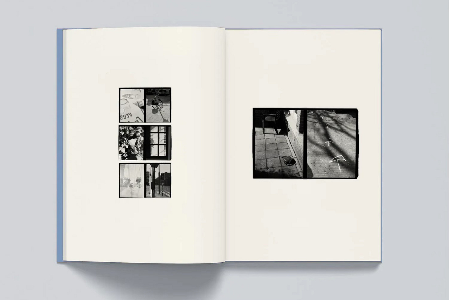
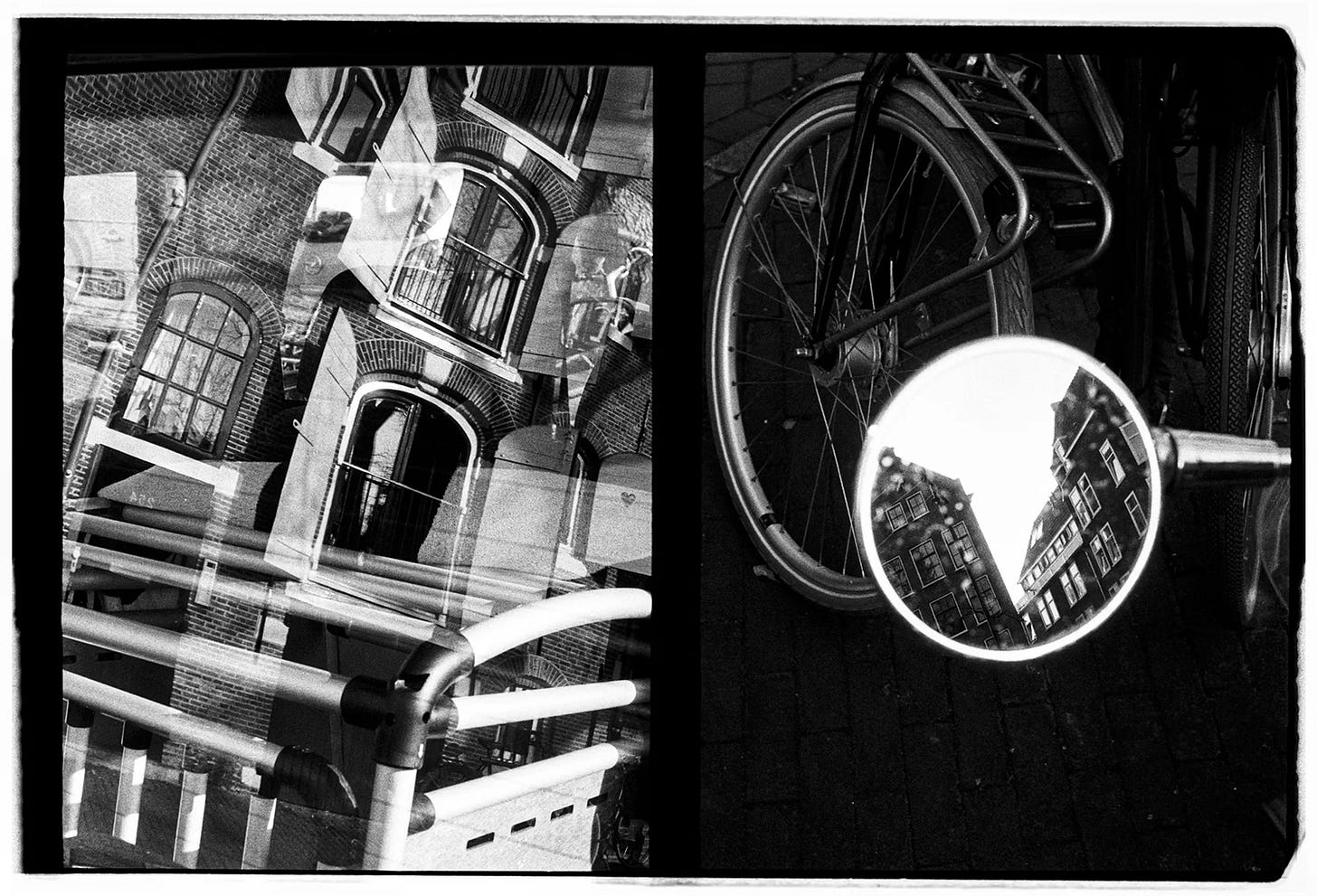
NM: It’s evident there’s a therapeutic aspect to the book and from the diptychs I have seen, it passes from photographer to viewer. The diptychs were made with a half-frame camera dating from 1964, how did you come about it, and why was this the tool you decided to work with as you made the photographs for the project?
WV: I came across the Pen-F when my friend Guy told me I should borrow his sometime, and it immediately intrigued me. It’s a unique tool because it shoots two images per frame, which means you’re not just thinking about individual photos—you’re thinking in pairs, almost like a conversation between two images. That format was perfect for this project because I wanted to tell stories through contrasts and connections. The camera forced me to be more thoughtful about how the images would work together and how they could reflect the themes of duality and transformation.
NM: You talk of storytelling through connection, contrast, and figurative conversation. Naturally, similarities can be drawn to cinema. I was struck by the tonal quality of the photographs and read that the film used was the black-and-white film favoured by Spielberg and Scorsese. Clearly, this was a deliberate decision. Do you see parallels between your photographic diptychs and wider cinematic storytelling?
WV: Yes, Double-X 5222 was the film I used, and it’s definitely got a cinematic feel to it, with its rich contrasts and depth. The idea of pairing images in diptychs does have parallels to cinematic storytelling in that each pair of photos works almost like a scene. They’re meant to create a dialogue, a push and pull between light and shadow, stillness and movement, or different emotions. In a way, it’s like editing a film—choosing which moments to place side-by-side to evoke a feeling or suggest a narrative arc.
NM: These diptychs, these pairs of photographs, reveal overlooked or unnoticed corners of Amsterdam. What was your process in deciding where to explore and when?
WV: It was a mix of intentional wandering and spontaneous discovery. I didn’t set out with a strict plan, but rather allowed myself to drift through the city, especially both neighborhoods I lived in over those three years, and let moments reveal themselves to me. I often found the most overlooked spots by walking at odd hours, when the light hit the city in interesting ways or when places were quieter. I wasn’t looking for traditional beauty—sometimes it was the texture of a wall, the pattern of shadows cast by a tree, or the way a reflection distorted a familiar scene. It was about letting go of expectations and being open to seeing something new in the ordinary.
NM: Being open to the unexpected every day that we step out the door is something I feel you and I share in our photography. I go back to Glasgow every year and find that I see it, and photograph it, differently each time. Did that cyclical nature of viewing Amsterdam in different springs show you the city in different ways? Were there moments when the city revealed something new and entirely unexpected?
WV: Absolutely. The cyclical nature of returning to the same places in different springs gave me a deeper understanding of how time and light shape the city. Each spring felt like a new chapter, even though the settings were often the same. Some streets or parks that seemed mundane one year would reveal something striking the next—maybe it was the way the light had shifted, or maybe I had changed in a way that allowed me to see them differently. There were definitely moments when the city surprised me, showing me a detail or a mood I hadn’t noticed before. And again, it was mostly about what was going on inside of me, and the city allowed me to see echoes of those emotions in its spaces.
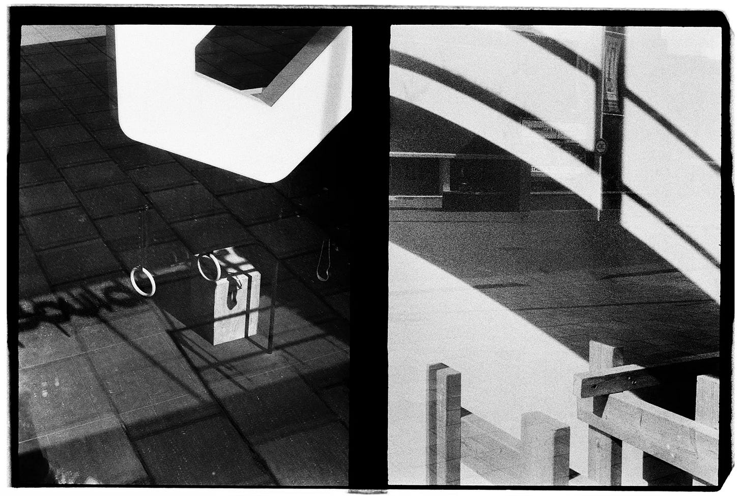
NM: You mentioned earlier that the diptychs are an interplay of light and shadow, but I also note reflection. The most striking aspect of the collection, though, is the often abstract use of line and geometry. For instance, in one diptych, you pair strong ladder-like lines with long arcing curves. Can you speak to some of the choices you made?
WV: Geometry and abstraction became key elements in how I approached the diptychs. I was drawn to the idea of using lines and shapes to create a visual rhythm, something that feels both structured and organic. The ladder-like lines paired with the curved arcs in that diptych were about contrast and balance. I wanted to juxtapose rigid, almost architectural forms with something more fluid and natural. It’s a visual metaphor for the tension between control and letting go, which is something I was experiencing personally while working on this project.
NM: Yes, it was certainly one of the pairs that had the biggest impact on me as I looked through the photographs. That juxtaposition of the unyielding lines against the pliant curves was artfully done. The diptych format follows naturally from using the half-frame camera, but how did the format shape your perceived narrative and emotional rhythm of the project both when making the photographs and then when sequencing for the book?
WV: The diptych format really did dictate how the project unfolded. When making the photographs, I was not always thinking about pairs, but when I was, I thought about how two images could speak to each other, either through contrast or harmony. It created a sense of rhythm in the way I shot, almost like a call-and-response. Other times, I would find my flow state and just shoot, discovering the pairing once my scans came in. When sequencing for the book, that rhythm became even more important. The diptychs allowed me to play with pacing and mood—some pairs are quiet and meditative, while others are more energetic or dissonant. It helped create an emotional journey for the viewer, much like how scenes in a film build tension or resolve.
NM: Finally, turning to the volume itself. The importance placed on the experience of nostalgia within the book is evident. You've included an essay, and singularly, a recipe, to accompany the film photographs. This is all bound in retro typography by Maxwell George. It's a visually striking cover. How do you imagine the interplay between the text, writing, design, and photography for the reader?
WV: I wanted the book to feel like more than just a collection of images—it’s an experience that draws on multiple senses and emotions. The essay by Caroline Cala Donofrio and the recipe by Hetty McKinnon both tap into themes of nostalgia and rebirth, and they offer a different layer of storytelling that complements the photographs. The typography by Maxwell George is heavily inspired by the Amsterdam school of design (1910-1930) and adds a retro, timeless feel that ties everything together. For me, the interplay between the text, design, and images is about creating a cohesive narrative where each element enhances the others, giving the reader something to feel, think about, and in the case of the recipe even taste.
And Finally…
Thanks to Wesley for our conversation, and good luck to him on the release of the book. I’ll be back next month, with more Dispatches, chapter 2 of The Tinnitus Diaries, and new Photos, mostly. It really is good to be back writing to you again.
If you’re new here, I’d be very grateful if you would subscribe to or share Photos, mostly. Sharing with 1 or 2 friends who enjoy street photography really will help more than you may think. Especially as I get this project back on its feet ready for 2025.
If you’re a Substack writer and enjoy this publication, I’d be more than humbled if you would consider recommending Photos, mostly to your subscribers.
Photos, mostly is free to read, however, paid subscriptions and donations help me keep making photographs and writing. All labour required to publish Photos, mostly is undertaken by me alone. As I strive to better live by my anti-capitalist beliefs, I will donate 10% of all income to anti-capitalist, leftist or progressive causes or organisations.
Please consider upgrading to a paid subscription or buying me a roll of film. You can do so by clicking here, or by aiming your smartphone camera at the QR code below.
I'm partial to some of that Tri-X 400 if you're asking. Thank you!


